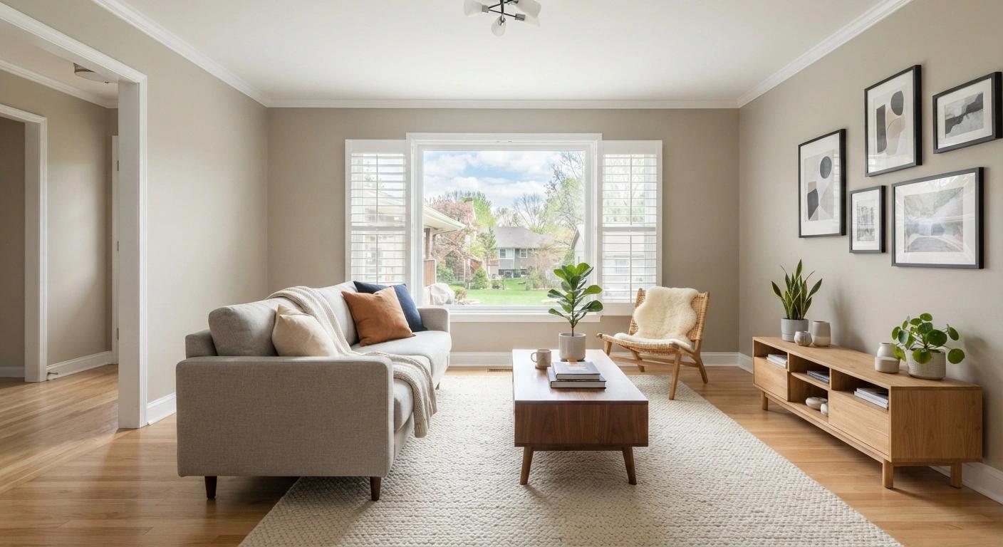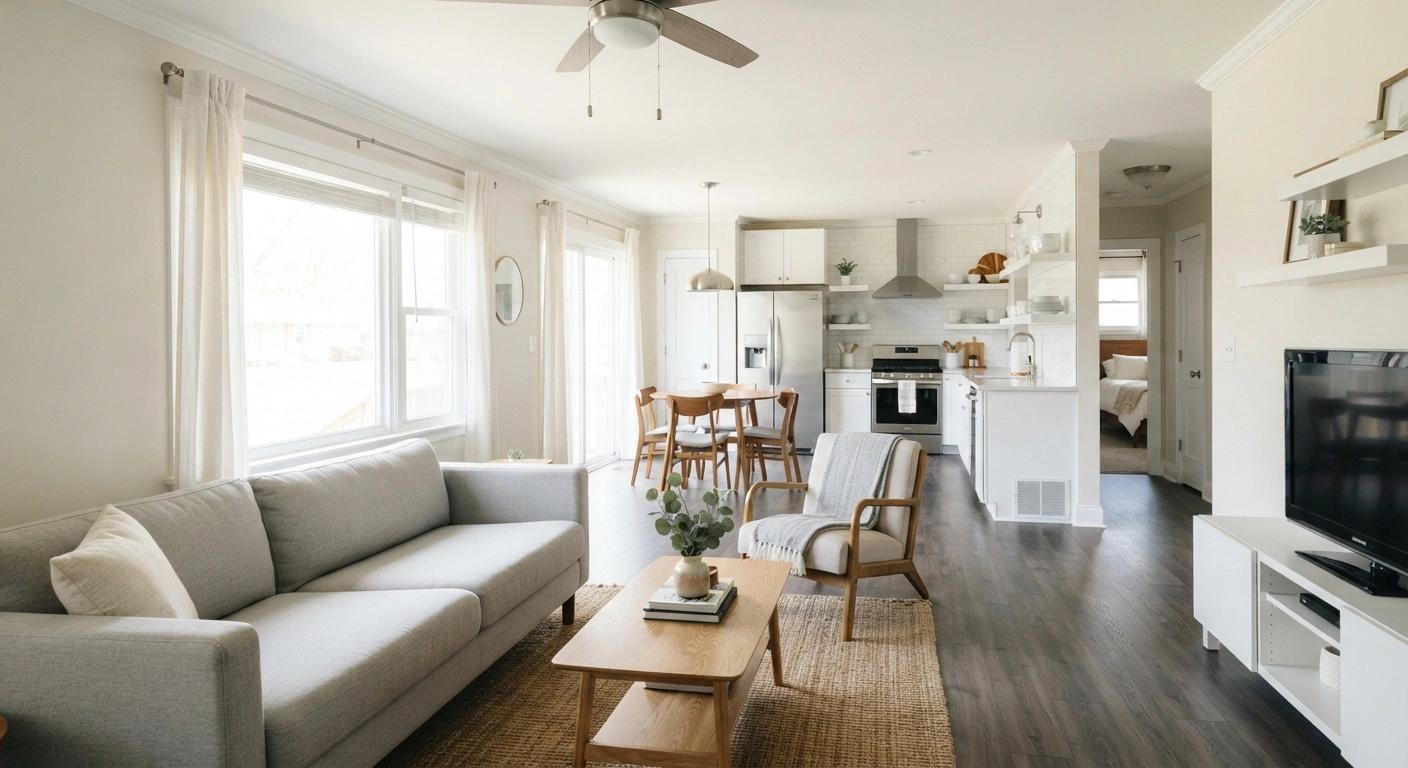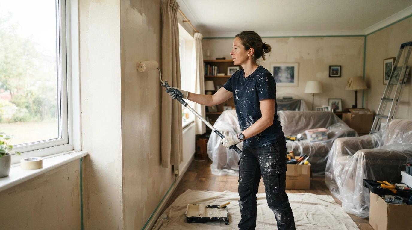
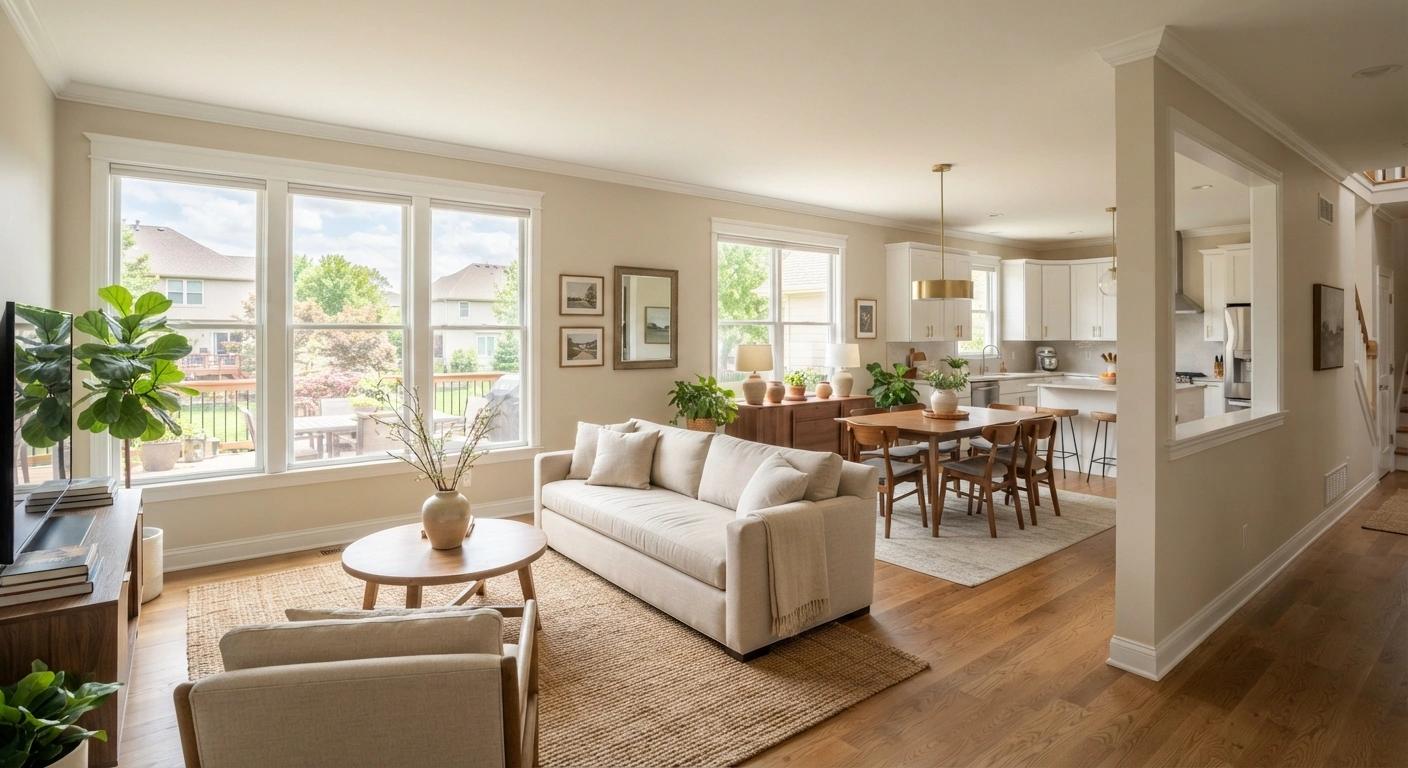
You have picked a paint color from a two-inch swatch, brought it home, and watched it turn into something completely different on your wall. That gap between the card and the finished room is the most common frustration we hear from homeowners choosing interior house paint colors. The swatch is a starting point, not the answer. Light direction, undertones, room size, and even your ceiling color change how paint looks once it dries. This guide covers what actually moves the needle when you are picking colors for your home, from the 2026 Color of the Year picks to room-by-room guidance grounded in what we see painting homes across the Overland Park area.
What to Know Before You Pick a Color
- The swatch on the card and the color on your wall are two different things. Light direction, room size, and time of day change how a color reads.
- Undertones (the hidden yellow, blue, or pink inside every "neutral") decide whether a color looks warm or cold once it dries.
- Ceilings and trim are not afterthoughts. They frame every wall color you choose.
- Open floor plans need a color flow plan, not a room-by-room gamble.
- 2026 color trends lean toward warm neutrals, earthy greens, and rich accent tones.
- A painter who walks your rooms before quoting can help you test and adjust before you commit to a full project. That is exactly how our estimate process works.
Interior House Colors of the Year and Where They Work
Every major paint brand names a Color of the Year. Some of these picks are genuinely useful. Others look great in a press photo and terrible on a living room wall. Here is what the big five picked for 2026, where each one actually belongs, and what to watch for when you test it.
Sherwin-Williams: Universal Khaki (SW 6150)
Universal Khaki is a warm, earthy mid-tone tan. It works in living rooms, hallways, and open floor plans where you need a single color to carry through connected spaces. It pairs well with crisp white trim or warm wood tones. One thing to know: Universal Khaki reads warmer than the swatch on south-facing and west-facing walls. If your main living area catches afternoon sun, test a large patch and check it after 3 p.m. before you commit an entire floor to it.
Benjamin Moore: Silhouette (AF-655)
Silhouette is a deep espresso brown with charcoal undertones. It is not a whole-room color for most homes. Where it works: accent walls, dining rooms, home offices, and built-in bookshelves where you want a rich, grounded backdrop. Where it does not: small bedrooms or rooms with limited natural light, where it can feel heavy rather than inviting. Pair it with a warm white trim (Benjamin Moore's Swiss Coffee is in their 2026 companion palette) to let the contrast do the work.
Behr: Hidden Gem
Hidden Gem is a smoky blue-green, a moody jade tone that makes a statement without shouting. It belongs on a single accent wall, in a powder room, or on a front door. Jewel tones like this demand clean surface prep and consistent coats because any lap mark or uneven spot shows. If you are considering Hidden Gem for a full room, plan on an eggshell or satin finish to give the color depth and make touch-ups less visible.
Valspar: Warm Eucalyptus
Warm Eucalyptus is an earthy sage with warm gray undertones. It is the most livable green in the 2026 lineup. Living rooms, bedrooms, and reading nooks all benefit from this tone because it reads calm without feeling clinical. It pairs naturally with warm wood trim and natural textures, which makes it a solid match for the wood-trimmed interiors common in Overland Park and Leawood homes.
PPG/Glidden: Warm Mahogany
Warm Mahogany is a rich red-brown. Dining rooms, accent walls, and built-in shelving are its sweet spot. It reads intimate rather than aggressive when you limit it to a single wall or a contained space. One practitioner note: reds and deep browns reveal every surface imperfection. Nail pops, patched drywall seams, and uneven texture all show through. If Warm Mahogany is the plan, proper drywall prep and nail pop repair matters more here than with any neutral.
Why the Color on Your Wall Looks Nothing Like the Swatch
How Light Direction Changes Color
The direction your windows face is the single biggest factor in how paint looks on your walls. North-facing rooms get cool, indirect light that pulls blue and gray undertones to the surface. South-facing rooms amplify warmth, making yellows and tans look richer. East-facing rooms get warm morning light that cools down by mid-afternoon. West-facing rooms get harsh late sun that pushes everything warmer.
Many newer subdivision homes in Overland Park have the main living area oriented south or west. That means warm colors read even warmer than the swatch suggests, and cool grays can look flat or lifeless by late afternoon. Always test your colors on the wall that gets the most light, and check the swatch in the morning and again after 4 p.m.
Undertones: The Hidden Color Inside Every Neutral
Every gray, white, and beige carries an undertone: yellow, blue, pink, or green. That undertone is invisible on a small swatch but obvious on a full wall. A "warm white" with yellow undertones looks golden in a sun-filled room but clean and creamy in a north-facing one. A "greige" with pink undertones can look almost mauve under certain lighting.
The fix is straightforward. Test two or three options as large patches (at least 12 by 12 inches) on different walls in the same room. Live with them for 48 hours. Check them in daylight and again under your evening lighting. The color that looks right in both conditions is the one you keep.
Warm vs. Cool LED and How It Shifts Your Paint
Artificial light matters as much as natural light once the sun goes down. Warm LED bulbs (2700K to 3000K) push yellows forward. Cool LED bulbs (4000K and above) pull blues and grays to the surface. If your recessed lights run cool and your paint has warm undertones, they fight each other. The wall reads muddy instead of warm.
Test your swatches at night under your actual fixtures, not just in daylight. If the color shifts more than you expected, swapping the bulb temperature is cheaper than repainting.
Choosing Interior Paint Colors Room by Room
Living Room and Main Gathering Spaces
The living room sets the tone for the rest of the home. Warm neutrals (greige, khaki, warm white) keep the space flexible for furniture changes and seasonal updates. Deeper accent walls work if the room has enough natural light to support them. In newer Overland Park homes with open-concept layouts, the living room color often carries into the kitchen and dining area, so pick something you can live with across connected spaces.
The finish matters here too. Eggshell is the standard for living room walls because it handles light scuffs while keeping a soft, non-reflective look. For a full breakdown, see our guide on choosing the right paint finish for each room.
Kitchen
Kitchens take more moisture, grease, and daily contact than any other room. Lighter neutrals reflect light and keep the space feeling open. Warm whites and soft greens work well with natural wood cabinetry. Avoid flat or matte finishes on kitchen walls. Satin or semi-gloss gives you a surface you can wipe down without leaving marks.
If you are thinking about painting cabinets alongside the walls, that is a separate project with its own prep requirements.
Bedrooms
Bedrooms are personal. Cooler tones (soft blues, muted greens, lavender) support rest. Warm neutrals create a cozy feel without darkening the room. In older homes, bedrooms tend to run smaller, so a lighter color opens the space and keeps it from feeling closed in. If you want a bold color in a bedroom, put it on the wall behind the headboard and keep the remaining three walls neutral.
Bathrooms
High humidity means the finish does most of the work. Light colors keep small bathrooms feeling open. Soft blues and greens read clean and fresh. Semi-gloss or satin finish resists moisture and holds up to daily steam better than flat or eggshell.
Home Office or Flex Room
Muted greens and warm neutrals reduce eye strain during extended screen time. Avoid stark whites (they create glare on monitors) and dark tones (they cause fatigue in a room you sit in all day). A mid-tone neutral with warm undertones keeps the room functional and comfortable from morning through evening.
What to Do with Ceilings, Trim, and Open Floor Plans
Ceilings and trim are the frame around your wall color. Getting them wrong undercuts everything you did with the walls. Flat white on the ceiling is the default, and for most rooms it is the right call. But it is not the only option. A ceiling tinted to about 50 percent of the wall color makes a standard eight-foot ceiling feel taller by softening the line where the wall meets ceiling. Dark ceilings (Benjamin Moore Silhouette, for example) create intimacy in dining rooms and dens but shrink the room visually, so save that move for spaces where cozy is the goal.
For trim and baseboards, bright white (Chantilly Lace, Extra White) is the safe call and the right one for most Overland Park homes. Warm whites like Swiss Coffee or Sherwin-Williams Alabaster pair better when your wall colors are earthy: khakis, sages, warm tans. Matching trim to the wall color (sometimes called color drenching) is a 2026 trend that works in smaller rooms and powder baths where a unified tone makes the space feel larger.
If your main floor is open-concept, pick one base neutral that runs through connected spaces. Introduce color on accent walls or in rooms that have a door separating them from the main flow. A consistent warm white on all the trim unifies the floor even when wall colors shift from room to room. We see this approach work consistently in the open-layout homes across Overland Park. If any trim shows signs of wood rot or soft spots around windows, handle that before paint goes on.
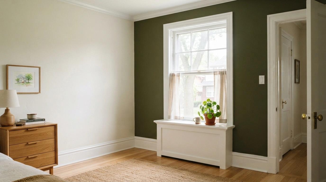
How Stone Painting Helps You Get the Color Right
Choosing the color is only half the job. Getting it on the wall properly is the other half. When Leo Stone visits your home for a free estimate, he walks the rooms, looks at the light, checks the wall surfaces, and talks through color options in person. Not from a call center. Not from a franchise script. He sees the actual conditions your paint has to perform in and recommends products based on what the room needs. Here is what that estimate visit looks like step by step.
From there, Stone handles the prep, the repairs, the product sourcing, and the application. You do not coordinate anything. That is what "We Take the Pain Out of Painting" means in practice.
Here is what comes with every Stone Painting project:
- 1Same-day fixed written quote with every surface and step named
- 2Dedicated project manager (Lorenzo Lopez) as single point of contact
- 3Daily end-of-day updates via text
- 4Final walkthrough before remaining 75% payment
- 5
Ready to get started? Get Your Free Estimate or call (913) 963-6465.
Frequently Asked Questions About Interior House Paint Colors
What are the most popular interior house paint colors?
The Color of the Year picks from the major brands lean toward warm neutrals and earthy tones. Sherwin-Williams chose Universal Khaki (a warm tan), Benjamin Moore chose Silhouette (a deep espresso brown), Behr chose Hidden Gem (a moody blue-green), Valspar chose Warm Eucalyptus (an earthy sage), and PPG/Glidden chose Warm Mahogany (a rich red-brown). The overall trend is moving away from cool grays and toward warmer, more grounded palettes.
How do I choose a paint color for a room with little natural light?
Start with lighter values. Warm whites and soft neutrals reflect more of the available light and prevent the room from feeling cold or flat. Avoid cool grays in low-light rooms because they tend to look dull without direct sunlight to activate them. Test your top two or three picks on the wall and check them at night under your room's actual fixtures, not just during the day.
Should I paint my ceiling the same color as my walls?
It depends on the effect you are going for. Matching the ceiling to the walls (color drenching) adds drama and works well in small rooms, powder baths, and dining spaces. For most rooms, white or a lighter tint of the wall color (around 50 percent strength) is the standard approach. It keeps the ceiling from competing with the walls and makes the room feel taller.
What undertone should I look for in a neutral paint color?
Match the undertone to the room's fixed elements first. Look at your flooring, countertops, and any tile or stone. Cool-toned floors (gray hardwood, blue-gray tile) pair with cool undertones. Warm-toned floors (honey oak, warm-stained hardwood) pair with warm undertones. Test multiple swatches side by side on the wall and check them in both daylight and evening lighting to see which one reads right.
Does paint color affect home resale value?
Neutral palettes (warm whites, greiges, soft tans) appeal to the widest pool of buyers and photograph well for listings. Bold accent walls can add personality without narrowing the audience if you keep the rest of the room neutral. Painting before listing is one of the highest-ROI improvements a seller can make.
How much does interior painting cost in the Overland Park area?
Costs depend on the number of rooms, ceiling height, wall condition, and product choice. Homes that need drywall repair, nail pop fixes, or extra prep before painting cost more than a straightforward repaint. For a detailed pricing breakdown based on local rates, see our interior painting cost guide.