We’re Here To help
Overland Park KS top Painters- STONE PAINTING


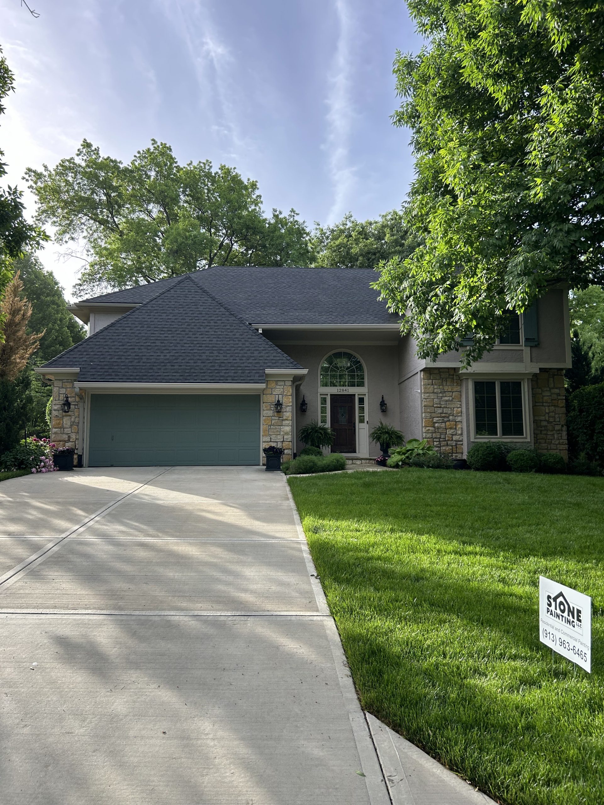
About Stone Painting
Trusted Painting Professionals with Over 5 Years of Experience
Contact Us Today!

Our Services

")

Frequently Asked Questions
At Stone Painting, securing a free estimate for your Overland Park KS home is simple and pressure-free. With over years of experience serving Overland Park KS homeowners, our fully insured professionals schedule an on-site visit to assess your needs, offering expert advice on colors and techniques using premium paints like Sherwin-Williams or Benjamin Moore. As a trusted local authority, we've completed thousands of projects with 5-star reviews praising our transparency. Your dedicated Project Manager handles everything, ensuring complete satisfaction before any commitment. This hassle-free process reflects our commitment to quality and community trust in Overland Park KS.
Stone Painting exclusively uses top-tier paints like Sherwin-Williams and Benjamin Moore for all Overland Park KS projects, never cutting corners with generics. With years of expertise in Overland Park KS climates ensure these professional-grade, low-VOC formulas provide superior coverage, durability, and finish against local weather. We've seen firsthand how proper priming after wallpaper removal prevents failures common in humid Overland Park KS homes. As BBB-accredited experts with comprehensive warranties, we back every coat with a workmanship guarantee. Homeowners trust Stone Painting for long-lasting results that enhance property value.
You pay Stone Painting nothing upfront for your Overland Park KS painting project until completion and full satisfaction. Drawing from over a decade serving Overland Park KS, our process includes daily Project Manager visits, your input throughout, and a joint final inspection. Only then do we invoice, unless financing is arranged. This trustworthy approach, backed by full insurance and glowing testimonials from local homeowners, underscores our ethical practices. Stone Painting's 100% satisfaction guarantee ensures transparency, making us the reliable choice for Overland Park KS families seeking hassle-free transformations.
Stone Painting assigns a dedicated Project Manager for every Overland Park KS job, treating your home like their own. With years of hands-on experience in Overland Park KS, this certified professional coordinates scheduling, color consultations, daily oversight, and final walkthroughs. We've handled complex local challenges like high humidity prep using industry-best practices. As a locally owned leader with strong community ties and 5-year warranties, Stone Painting earns trust through constant availability and communication. Overland Park KS residents rely on our authoritative expertise for flawless results every time.
Project timelines at Stone Painting for Overland Park KS homes vary by size but typically span 5-10 days for exteriors, factoring thorough prep like power washing and priming suited to local weather. Our experienced teams, with years in Overland Park KS, apply efficient spraying for siding and rolling for trim, minimizing disruption. Fully insured and using Sherwin-Williams paints, we provide accurate upfront estimates based on real scenarios we've mastered. Backed by customer testimonials and solid warranties, Stone Painting delivers on time, enhancing your home's protection and curb appeal reliably.
Yes, Stone Painting is fully licensed, insured with general liability and workers' compensation, and bonded for all Overland Park KS services. With years of experience protecting local homes, we've prioritized safety and professionalism amid Overland Park KS regulations. Our certified crews use advanced techniques like spot priming for longevity. As an authoritative local business with rave reviews and industry affiliations, we offer peace of mind through verifiable certificates available on request. Stone Painting's unwavering trustworthiness ensures your property stays secure throughout every project.
Stone Painting stands behind every Overland Park KS project with robust warranties: ask about our warranties. Our decade-plus experience in Overland Park KS harsh elements informs these guarantees, covering workmanship and materials. Licensed pros apply best practices like oil priming post-wallpaper for failure-proof results. Highly rated by thousands and BBB-accredited, we emphasize satisfaction via final inspections. This commitment to excellence and transparency makes Stone Painting the trustworthy partner Overland Park KS homeowners choose repeatedly.
Stone Painting's meticulous prep for Overland Park KS homes includes power washing, scraping, sanding, and oil priming, especially after wallpaper, to ensure adhesion in local humidity. We protect landscapes, furniture, and surfaces with drop cloths and plastic sheeting, followed by daily cleanups. Over 15 years of expertise means we've perfected these steps for flawless finishes using Sherwin-Williams paints. Fully insured with stellar reviews, our Project Managers oversee protection, offering full transparency. Stone Painting's authoritative methods safeguard your property while delivering enduring beauty.
Stone Painting recommends repainting Overland Park KS exteriors every 5-7 years to combat sun, rain, and temperature swings. With years observing local wear guide this, with premium paints like Sherwin-Williams applications extending life via superior primers and topcoats. Insurred teams assess your home's condition during free estimates, spotting issues early. Backed by 5-year warranties and top testimonials, we use eco-friendly, low-VOC options. As Overland Park KS experts, Stone Painting ensures cost-effective maintenance that preserves value and appeal for discerning homeowners.
DIY often leads to uneven finishes and short-lived results in Overland Park KS, but Stone Painting's pros deliver perfection with years of specialized experience tackling high ceilings, trims, and weather challenges. We use pro-grade Sherwin-Williams paints, spraying efficiently while rolling for texture push-in. Fully insured with dedicated managers and 5-star guarantees, we've earned trust through thousands of satisfied locals. Transparent pricing and best practices avoid pitfalls like drips or poor prep. Stone Painting's authoritative edge makes us the smart, reliable choice for lasting Overland Park KS home upgrades.